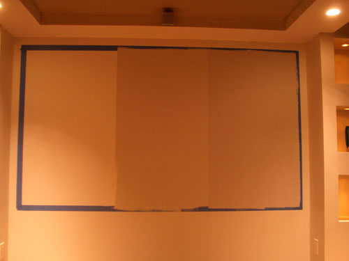
As the basement creeps closer to completion, the task of building the movie screen nears. Of course there are all kinds of screens you can buy, but good ones are really pricey. Building one can save you a bunch of money and you can tailor it to exactly suit your space. Part of that tailoring process is choosing a paint.
The choice of paint color is actually pretty tricky. It’s a matter of optimizing picture quality – typically improving contrast without sacrificing brightness – for your specific projector and typical ambient light. Ambient light is a factor of all kinds of things, like how dark you keep the room while viewing, the color of adjacent walls and ceiling, choice of flooring, etc. You may think the brighter the picture the better, and as such a bright white screen would be ideal. But that’s usually not the case. With a very bright white screen ambient light is easily reflected and any dark colors in your picture are easily washed out. White screens are really only good in very dark environments or in cases where you need to increase your overall brightness at all costs (like in business applications in many cases).
My projector is LCD which inherently is pretty bright (even in “low lamp mode”) and has good, but not great contrast and black levels. LCD projectors shine light through LCD panels and even “off” pixels tend to let some light through so blacks are never pitch black. On the other hand, I like the fact that I can keep the lights up halfway and still have a very viewable picture – especially when watching sports. Still with the lights up at all the picture is prone to getting washed out. To make matters worse, our walls, ceiling, and floors are fairly light in color – a sacrifice I made to get the look we liked. So what do you do to compensate for (1) the LCD brightness and (2) a reasonable amount of ambient light? You use a gray screen. The question is “which shade of gray”?
After some research and good advice I’ve settled on two different shades to test. This week I taped off my screen area into thirds and painted the two shades and left the other third the white drywall primer that we’ve been watching movies on for a few months now.

Even though the painted wall doesn’t reflect the same as the eventual painted screen, I figured it’d still be fair to compare relative shades. For the viewing I watched all sorts of material (high def/standard, sports/movie scenes) at different room lighting levels. I also moved around the room to see if viewing angle had much effect (which it didn’t). I often used the freeze feature on the projector to keep a static image on the screen for consideration.
Here you can see a big difference even in a dark room between the white primer and the shades of gray paint (look at Barkley’s “black” jacket). Sure, the whites are darker as well, but it’s the blacks that really matter. They give depth to the picture and really make it come alive. As long as the contrast is set well whites will pretty much always look bright by comparison. Looking at the lighter gray (middle) to darker gray (right) it’s tough for me to distinguish much improvement one way or the other.

Now in a brighter room, the difference between the gray shades tends to pop up more. The darker gray is keeping the ambient reflection down (of course along with the picture itself) and a darker image is maintained. Here too you can really see how washed out the white screen would be (left).

So, is there a clear winner? I’m still debating. If the majority of viewing were to happen with the lights up, I’d lean to the darker shade. But since we tend to watch the projection more often than not in a darkened room, I’d say the lighter gray (middle) is appropriate and it avoids losing any shadow details. Stay tuned for a final decision…
Tags: Basement


Great ideas and execution of them!
I have the same issue figuring out the angle for th molding on the stair runner. How did you figure out the angle?